OpenType Features: Alternates

I love fonts. I suppose that’s a bit obvious. I did choose to make them for a living. I especially like fonts that are imperfect- ones that are rather quirky, whimsical or organic. Again, probably not a surprise if you take a look at my catalog.
But what if I told you that my favorite kind of fonts are ones that don’t look like fonts at all?
Have you ever seen one of those rustic home decor signs? You know the type. Probably wood or metal with sentimental text in a hand drawn script? At least you assume they’re hand drawn (at least originally). They must be custom done, right? Because the letter L in Live doesn’t look like the letter L in Love, and- now that you really look at it- the v and the e are a bit different, too. So there’s no way it could be a font. Right? Well, maybe. Maybe it’s not. Or maybe it’s using a font with some OpenType features.
OpenType Features
And what are OpenType features? In short, they’re extra options. OpenType features allow end users the ability to further customize the look of their text. So if you love fonts but haven’t heard of, or really dived in with, OpenType features, well, get ready, because it’s about to get amazing.
It’s like…
It’s like going to your favorite restaurant and learning there’s a secret menu you never knew existed. It’s like finishing Lord of the Rings, thinking it’s all over, and then finding the appendices (Arwen and Aragorn backstory, yes please!). It’s like watching the incredible Avatar: The Last Airbender animated series and then realizing there’s a live action movie. Wait, nevermind. Scratch that last. There is no live action movie in Ba Sing Se. (Sorry if you don’t get the reference. But also not. You should watch it.)
Uh, yeah. I may have digressed. But you get the point. OpenType features are awesome.
And if it sounds difficult or overly technical, don’t worry, it’s not hard at all once you know what to do and we’re going to walk through it step by step. Plus, it’s fun and it’s one of those small things that can really take your designs to the next level.
Alternates
Now there are all sorts of goodies to be found once you enter the wonderful world of OpenType features, but we’re going to start with one of the most basic and popular features: alternates.
These are exactly what they sound like, alternate versions of letters or other font characters.
Now let’s say you need help choosing a font for the logo of your new business, Cabbage Caboodles. First, I’m going to have a lot of questions. Second, I’m going to recommend you choose a font with OpenType alternates. Specifically one that includes alternates for the letters C, b, and a. It’s important to keep that in mind, because some fonts have alternates for all the upper and lowercase letters, while others just put in a few, or some none at all.
Using OpenType Features in Photoshop
For this example, I’m going to use my font Hodgepodgery to show you how to use OpenType alternates in Photoshop. Now different programs access (or don’t) OpenType features differently, but we’ll cover more in subsequent posts. 🙂
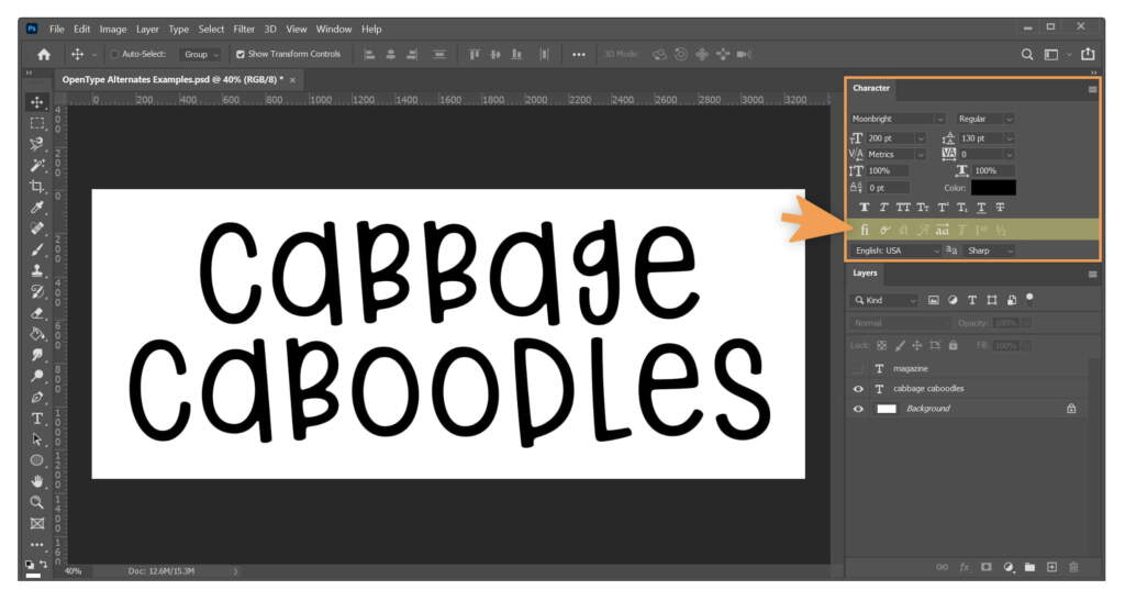
So let’s get started with a simple Photoshop file with Cabbage Caboodles typed out in the Hodgepodgery font. It should look something like this:
Now you’ll notice I highlighted some of the tools on the right. The line of tools highlighted in yellow control OpenType features. You’ll see some of them look faded and others look bold. The bold buttons mean that they are available for use in that particular font. The Hodgepodgery font contains ligatures, contextual alternates, and stylistic alternates, so those buttons are bold and available for use.
If you can’t find these tools, make sure your Character window is open (seen outlined in orange in the photo above.)
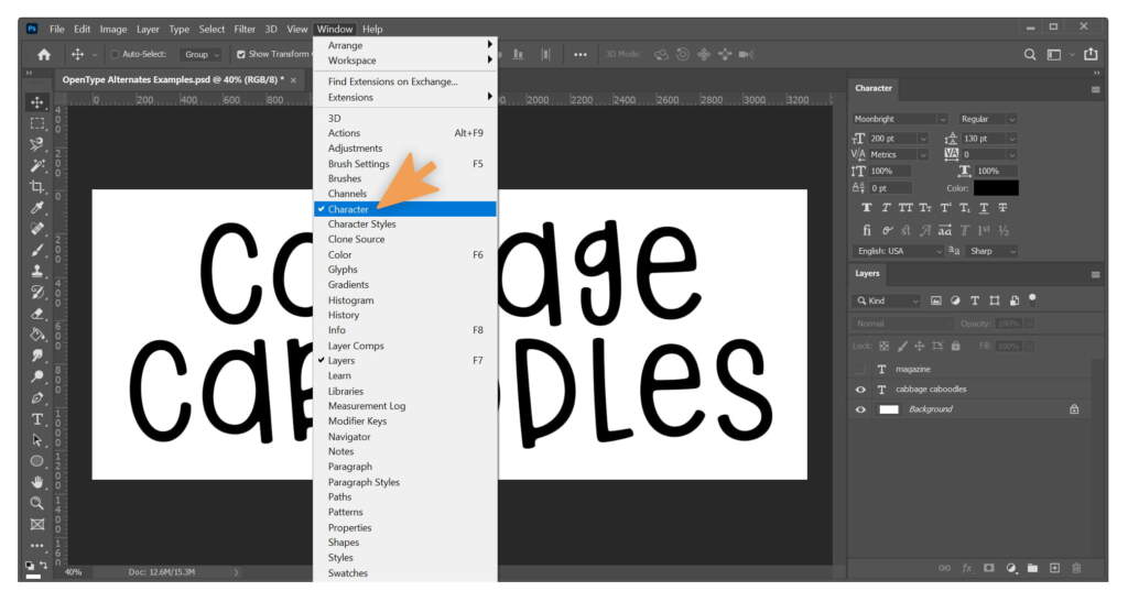
If you don’t know how to open it, click Window in the Photoshop Menu and then click Character.
Contextual Alternates
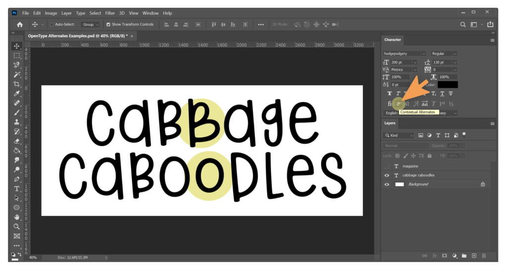
Okay, to start we’re going to use that second button that looks like a cursive o. This is the Contextual Alternates tool and if you click it you’ll see two changes right away.
Both the second b and second o change to a slightly different character. That’s because in this font I have programmed some characters to be replaced in certain contexts. In this case, I designed the font to, whenever two of the same lowercase letters are next to each other (aa, bb, or cc, and so on), replace the second character with an alternate. These automatic replacements in certain pre-programmed situations are called contextual alternates.
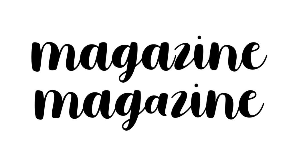
Here’s another example of a contextual alternate in my font Moonbright.
On the first line, magazine is typed out normally, with contextual alternates not turned on. The az combination is awkward because the connector doesn’t reach the z. That’s why I set up non-connecting contextual alternates in the font. I turned them on in the second line of the image and the a automatically replaced itself with the alternate non-connecting a.
Stylistic Alternates
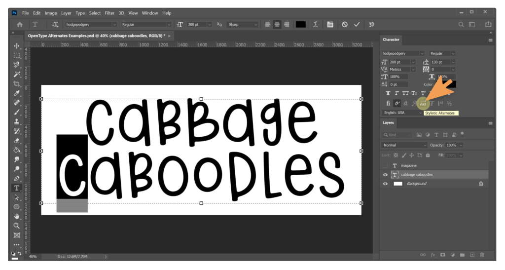
Another type of alternate is the stylistic alternate. Stylistic alternates are just alternates that you can choose to use simply based on your stylistic preference. They are not subject to any contextual limitations. Just use them. Or not. It’s up to you! 🙂 You can make a letter use it’s stylistic alternate (if one is available) by clicking the Stylistic Alternates button (the one with two as with an arrow highlighted in yellow below).
In this example, I highlighted the c at the beginning of caboodles and then clicked on the button since that’s the only letter I wanted to change.
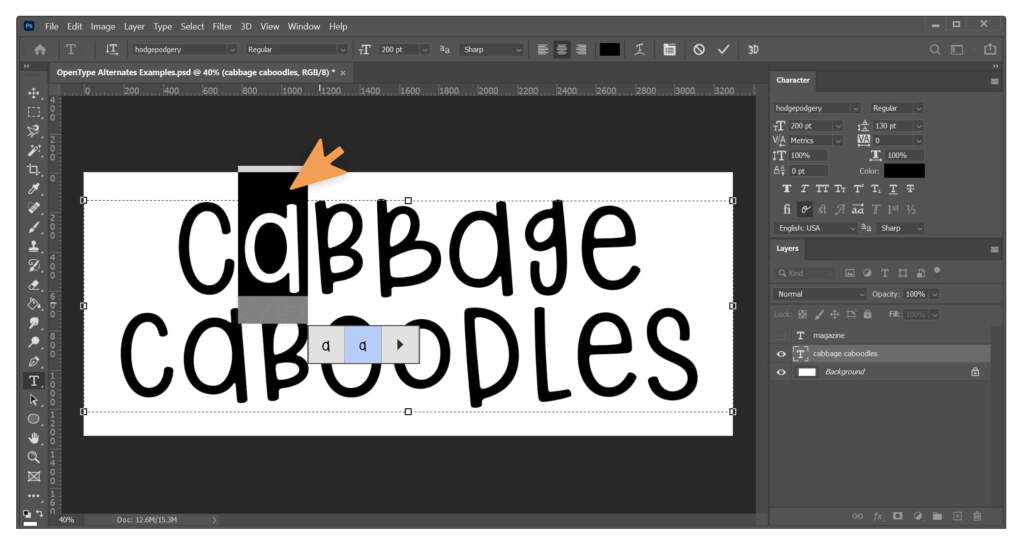
But there’s one more way you can access alternates to change them and it’s super simple. Just highlight the letter you want to change, hover on it, and it will give you all of the options to choose from for that character.
You’ll see I used this method here to select the alternate a for the first a in cabbage.
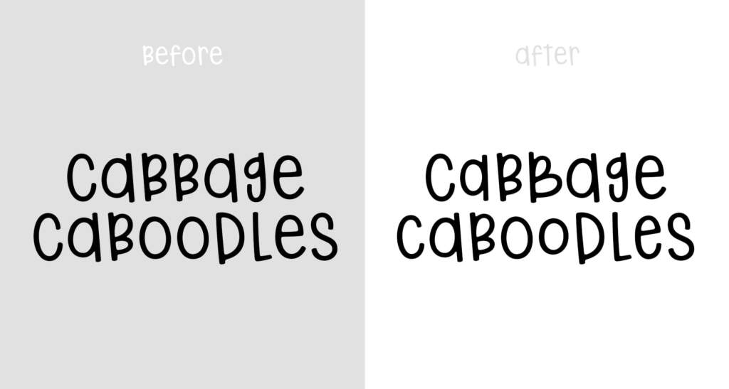
I went on the change the e in caboodles as well and here’s the final comparison.
The effect is fairly subtle, but even with those small changes, the second example already feels warmer, more inviting, and more organic.
Wrapping it Up
I hope that this quick tutorial was helpful! More importantly, I hope that it will inspire you to get out there and check out some fonts with OpenType features and play around with them. 🙂
Let us know if you have any questions in comments. Or feel free to show some examples of how you use OpenType alternates in your own designs!

